Multi Passengers Seat-Select
Air New Zealand Mobile App
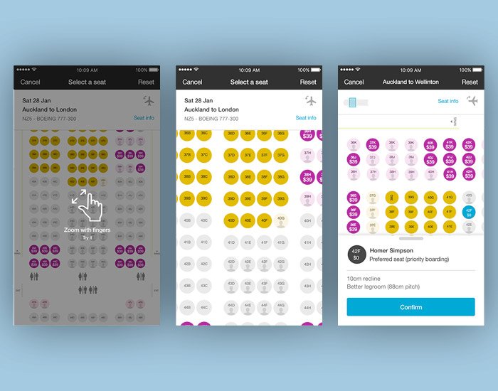
The project was to design a new seat map and seat selection experience for Air NZ’s Mobile app users.
The Challenge
Selecting a seat for a single passenger on a single flight is straightforward. But what about:
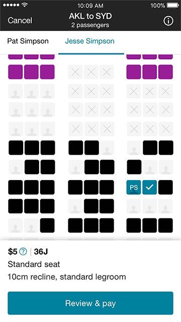
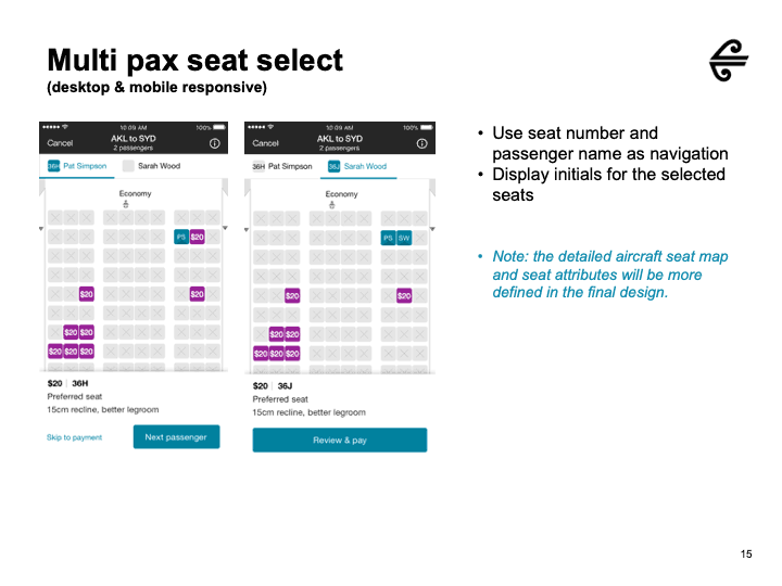
Choosing seats for all passengers in the same booking?
Selecting seats across multiple flights in the same booking?
Viewing the seat map and selecting seats on a mobile device, especially for long-haul flights with 10 seats per row?
My Role
UX Design
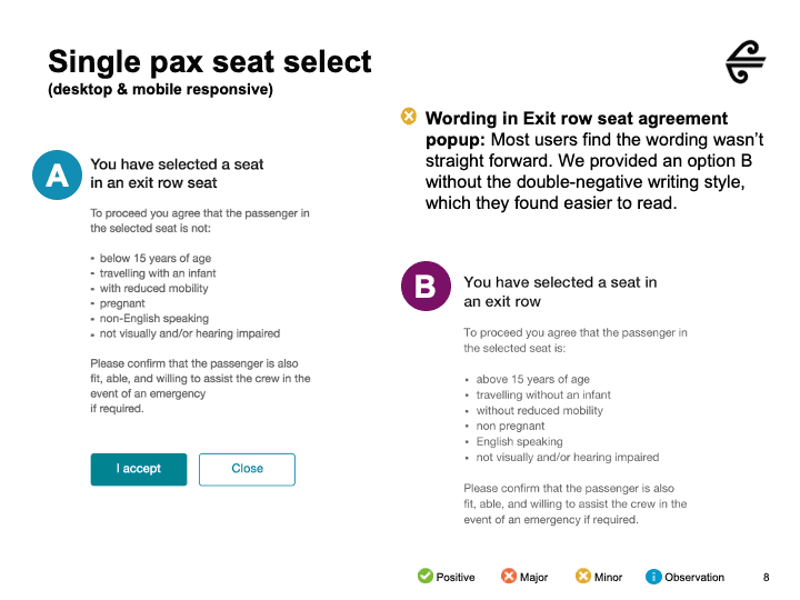
User Testing
Result
The new mobile interaction flow has transformed how passengers utilise the seat-select feature on both their mobile phones and the Air New Zealand web portal. During user testing, participants expressed high satisfaction with the interaction concepts. This pioneering project focused on achieving a seamless and consistent user experience across mobile and web platforms, ultimately profoundly impacting the current Air New Zealand online seat-select model.


